- Jun 11, 2014
- 16,720
- 16,674
Founding Member
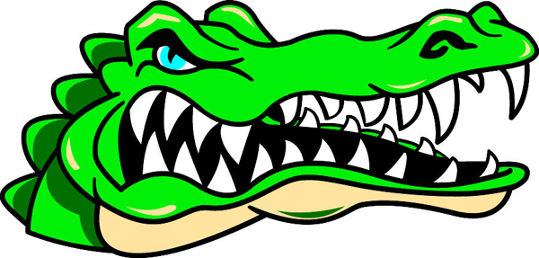
Think the writing of Gators on the side of the helmet looks like a kid put it on there. Should be updated

Think the writing of Gators on the side of the helmet looks like a kid put it on there. Should be updated
This is GATOR board. I am a GATOR fan. I like GATOR colors.
Logos, maybe. I do think unis could use some updates, but I know a lot of people don't.
I think this is it. I don't see a whole lot different from the old Albert, other than the turtleneck and orange cap are gone.Didn't Albert get softened up back in the 80's cuz he was scary to children?
Such trash. I used to see those occasionally on the discount rack. Looks like a middle school art project.Not needed IMHO.
I still like this version from the 70's and 80's.....

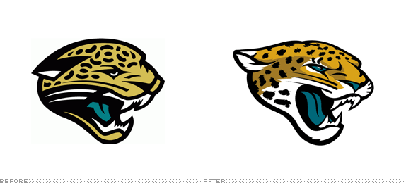
Nothing about the Jags is close to amazing.What the Jaguars did last year is the kind of thing I'm talking about. They took their basic logo, which came out around the same time ours did, and modernized it. And it looks amazing.
I'm sorry that you're so disrespectful of the era that I went to UF. I'll try not to let my feelings get hurt.Such trash. I used to see those occasionally on the discount rack. Looks like a middle school art project.
They rebranded cause they suck.What the Jaguars did last year is the kind of thing I'm talking about. They took their basic logo, which came out around the same time ours did, and modernized it. And it looks amazing.
Yeah, the Jags did it.....That's a great reasonWhat the Jaguars did last year is the kind of thing I'm talking about. They took their basic logo, which came out around the same time ours did, and modernized it. And it looks amazing.

Exactly. They should rebrand by moving to a new city, getting new mascots and. colors.They rebranded cause they suck.