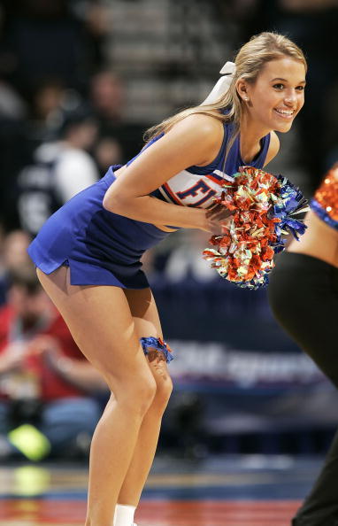
Drag coefficent on the "Gators" vs. "F." Much better. You're a car guy. You knew that.Sleeker?
You are using an out of date browser. It may not display this or other websites correctly.
You should upgrade or use an alternative browser.
You should upgrade or use an alternative browser.
Oh No: White helmets for UGA
- Thread starter SGG
- Start date
True. My balls hang in tandem for the same reason.Drag coefficent on the "Gators" vs. "F." Much better. You're a car guy. You knew that.
SavannahGator
Behind Enemy Lines
Which side of Saturday's helmet do you prefer? I think I'm partial to the left. Looks sleeker.
From the video posted on UF Football's FB page, it appears to me that BOTH sides are going to have the script Gator. Nonetheless, despite everyone else disliking it, I like the slanted F and do think it looks "quicker." I don't like two different logos on either side. Choose one and stick with it for both sides.
I like the F, but I'm not entirely a "get off my lawn" type, either. I do agree the F looks bad on the helmet and the Gators script is the definitive look for the helmet, preferably in orange.I'm not generally as opposed to the dreaded slanted F as most others. But I don't think it looks right on the helmet at all. And again, power of perception and association. I'll take the left. Oohh, also maybe that left one in orange. That sounds really nice.

Yeah, same effect as a rear differential.True. My balls hang in tandem for the same reason.
The slanted F is GAF and should never be on anything. It was a Jeremy Fooley approval and has his stench all over it. The block F is bad ass and should be used on both sides of the helmet. Even the UF intertwined looks good. Gator head logo would look good. Bury that slanted F.
The slanted F is GAF and should never be on anything. It was a Jeremy Fooley approval and has his stench all over it. The block F is bad ass and should be used on both sides of the helmet. Even the UF intertwined looks good. Gator head logo would look good. Bury that slanted F.
We talkin bout fonts.
We always say the Gator head, but in reality it doesn't really work on the helmet. It's actually better as an accent piece on the jersey or pants.The slanted F is GAF and should never be on anything. It was a Jeremy Fooley approval and has his stench all over it. The block F is bad ass and should be used on both sides of the helmet. Even the UF intertwined looks good. Gator head logo would look good. Bury that slanted F.
(And I'm about to get some major shyt for saying that.)
How does this “not work”?We always say the Gator head, but in reality it doesn't really work on the helmet. It's actually better as an accent piece on the jersey or pants.
(And I'm about to get some major shyt for saying that.)

Yes. Block font is much more conservative just as the cursive Gators. Slanted looks like a liberal millennial designed it.We talkin bout fonts.
I just read a post of yours and agreed with everything you said.I don't like the Gator head logo on the helmets, either - just doesn't look right. The slanted F doesn't bother me like it does some of you but I really like the script and think it looks pretty good on the white helmets.

This conversation helps me better understand why the designers of the new helmet chose multiple logos. It appeases more fans. Maybe that is the best way to go.
It's actually not a bad look, but, please, no head-to-toe white look. That's a bit much. Give the fans some orange or blue on the road to break up the monotony of all-white. I don't wanna look like Miami.
It's actually not a bad look, but, please, no head-to-toe white look. That's a bit much. Give the fans some orange or blue on the road to break up the monotony of all-white. I don't wanna look like Miami.
I’ve always been partial to classic blue myself.

Yeah, I’d look good in that!
@GatorsFB: #UFvsUGA ➡ 
#UniWatch
#GatorStandard
#JUMPMAN
@GatorsEquipment
#GoGators
#UniWatch
#GatorStandard
#JUMPMAN
@GatorsEquipment
#GoGators
Depends what you mean by "in."Yeah, I’d look good in that!
Users who are viewing this thread
Total: 2 (members: 0, guests: 2)