Welcome to the new Gatorchatter! Post all your issues and annoyances here!

Jack o' Diamonds

My mind is made up, don't confuse me with facts...
Lifetime Member
Aug 29, 2015
1,805
3,236
@oxrageous I didn't care for it in the last version.. This looks better than before.. Or maybe I just don't remember..I do meet new people every day....
 

GatorFL

Well-Known Member
Lifetime Member
Oct 29, 2017
1,691
2,882
We moved the "hamburger" menu from bottom right to top left on another forum I am on somehow. Bigger board though and we have a developer on staff. X2 has some low cost upgrades/shortcuts out there. I can send you a screenshot if you want Ox.
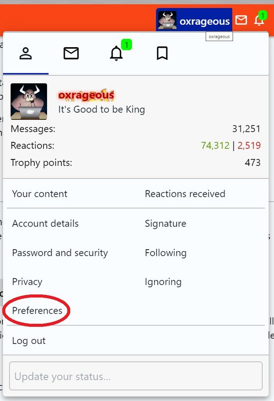
Thought I would point out some new features that you may or may not have noticed, and how they work. Make sure everyone goes to their preferences and looks at everything. For example, there are a ton of notifications you are going to want to set.

trt4545.jpg


1) A reminder that there is a "Dark Mode" for Gatorchatter - about 15% of our people prefer it. At the very bottom of the page is a dropdown where you can select Dark or Lite mode.

2) The floating circle on the bottom right is our new quick navigation menu. Unfortunately, the one we always used along the left side is not available for X2, and this is the best we have for now. I'll be looking for alternatives as time marches on. Maddeningly, you have to click around the edges of the circle for it to open up - hitting the dead center does nothing. After it's opened, clicking anywhere else on the page will close it. If you don't want this option, it can be removed in preferences.

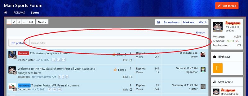
3) If you want to quickly start a thread in any area, there is a bar along the top of the forum list. When you click in that, the edit box opens under it and you can start typing. If you change your mind, clicking "cancel" in the lower right will close it.

trt45.jpg


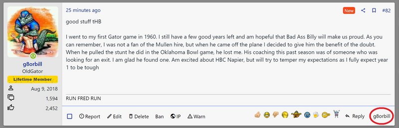
4) In the bottom right of every post next to the "Reply" button, you see that posters name there. That is a tag function, which tags that poster into your reply box. In other words, click "Reply" to quote them, click their name to tag them. This is in case you would rather just tag them then quote their post. It's a great way to reply directly to them without having to type the whole "@" thing. The user normally gets a notification if they are tagged, unless they have that notification switched off.

trt454.jpg


5) Android Users: You can enable push notifications on your phone, which would alert you like a text message when you get a PM, for example. In preferences, there's an area to approve push notifications. Unfortunately, Apple has not provided support for this at this time for the iPhone folks.

6) Giphy support: Now in posts and in the chatbox, you can click on the "GIF" option on the editor bar and search for the perfect gif to enter into the box.
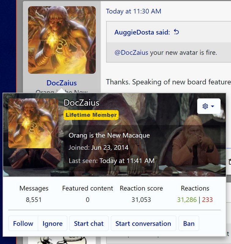
7) As discovered by @DocZaius, you can edit your background on your profile banner. Go to your profile page and click "Edit Profile Banner" in the upper right hand side at the top.

trt454544.jpg


More to come.
 

G. Gordon Gator

Intrepid Chauvinist
Lifetime Member
Aug 14, 2018
10,768
20,655
I prefer it on the left on desktop, no doubt. On mobile it's terrific where it is, and 60% of our total traffic now is on mobile.
On the desktop version I see in Chrome, the blue borders are very wide on either side of the "operational area" of the site, which seems more narrow and constricted than it needs to be.

For example, under where it says "Staff Online" in the third column on the right side, that whole column is squeezed so tight that it cuts of the "s" in oxrageous, which appears on the next line. Meanwhile there's plenty of room in the empty blue borders on either side of the page for the whole thing to be wider.

Is the horizontal width of the page something that each person can adjust, or is the central section narrow like that on desktop to keep it consistent with the more vertical mobile version?
 

oxrageous

Founding Member
It's Good to be King
Administrator
Jun 5, 2014
37,082
98,223
Founding Member
@G. Gordon Gator Zoom the page, dork.

I don't see what you do in terms of squeezing. Would need to see a screen shot.
 

G. Gordon Gator

Intrepid Chauvinist
Lifetime Member
Aug 14, 2018
10,768
20,655
@G. Gordon Gator I just made a change on page width - I think it will fill in those side gaps.
Nice! That did the trick. The column on the right is still "crunched," but no more useless blue borders. Wider posts = faster scrolling. :thumbup:

Screenshot 2022-06-08 085419.png

Now I just noticed another issue, though. There seems to be some emoticon/smiley options missing?

I no longer see the "basic" smilies, the most commonly used ones that would appear at the top. Like the standard smiley face, sad face, wink, eyeroll, grin, etc. Those used to be the first options in the smiley box but now I can't find them at all?
 

G. Gordon Gator

Intrepid Chauvinist
Lifetime Member
Aug 14, 2018
10,768
20,655
@oxrageous here's another screenshot so you can see that the right column is still narrow enough to truncate the "n" in G. Gordon and the "s" in oxrageous, if that matters to you. Doesn't to me.

Screenshot 2022-06-08 091139.png
 

oxrageous

Founding Member
It's Good to be King
Administrator
Jun 5, 2014
37,082
98,223
Founding Member
Nice! That did the trick. The column on the right is still "crunched," but no more useless blue borders. Wider posts = faster scrolling. :thumbup:

View attachment 43841

Now I just noticed another issue, though. There seems to be some emoticon/smiley options missing?

I no longer see the "basic" smilies, the most commonly used ones that would appear at the top. Like the standard smiley face, sad face, wink, eyeroll, grin, etc. Those used to be the first options in the smiley box but now I can't find them at all?
@G. Gordon Gator You can't find them because I deleted those hideous standard smileys.

I have no idea why your sidebar is showing so narrow. Seems like the avatar boxes on the left are a little narrow too. Are you on a Mac? It doesn't do that on my end. Please go to Dark Mode and tell me if it's the same for you.
 

G. Gordon Gator

Intrepid Chauvinist
Lifetime Member
Aug 14, 2018
10,768
20,655
@G. Gordon Gator You can't find them because I deleted those hideous standard smileys.

I have no idea why your sidebar is showing so narrow. Seems like the avatar boxes on the left are a little narrow too. Are you on a Mac? It doesn't do that on my end. Please go to Dark Mode and tell me if it's the same for you.

On dark mode the side columns are even more narrow. And no, not a Mac, right now I'm using a Samsung PC laptop.

Screenshot 2022-06-08 093546.png
 

NavetG8r

Founding Member
Stupid
Lifetime Member
Jun 11, 2014
16,720
16,674
Founding Member
By the way, this isn't a complaint really, more an observation. I noticed when you went with the shrunken forum part where we saw blue at the left and right of the screen, the pages seemed to be loading much faster than in the past. Today, now that the white forum page part is back across the entire screen, the page loads are a bit slower again. I mean it's not like it takes 15 seconds or anything so it's not a major problem. Just something that was noticeable to me. On desktop.
 

I Have No Friends :(

Founding Member
Gator Bait! It's only racist to dumb Fuchs
Lifetime Member
Jun 14, 2014
3,977
12,866
Founding Member
I would split the difference with the blue border. The way it is now is a bit of an eyesore.
 

Users who are viewing this thread

Help Users

You haven't joined any rooms.